Master - Pioneering real estate investment
Developing a brand identity for the leading real estate developer.
Master is one of the oldest and most prestigious real estate developers in the region who are shaping the industry with their vision on urban cities buildings. The company has a long legacy in the market with a history of successfully established projects across the country covering medical, residential, and commercial sectors. And as part of their 360 degree business evolution program, we were tasked to come up with a brand new identity that delivers the promise of modernity while communicating the brand heritage.


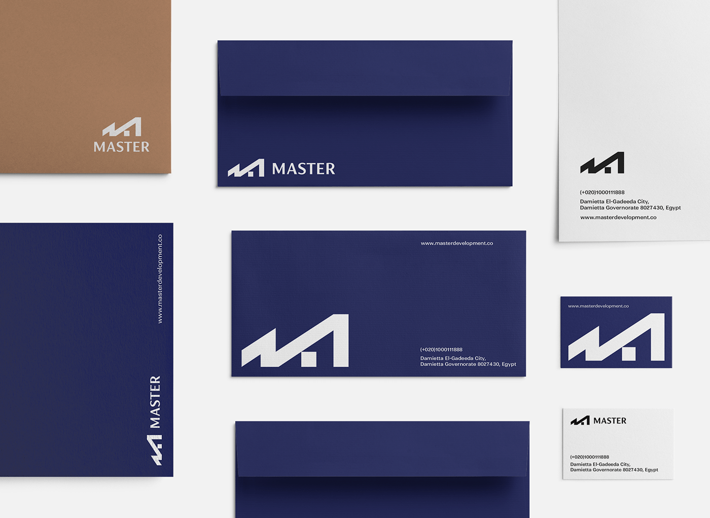
A symbol of growth and investment
With bold, thick strokes the brand mark dominates to the brand identity and casts an impression of growth and agility. The sharp lines draws the brand initial letter (M) intersecting at the top in one sharp point to symbolize a growth scale and also give an over all impression of real estate buildings.


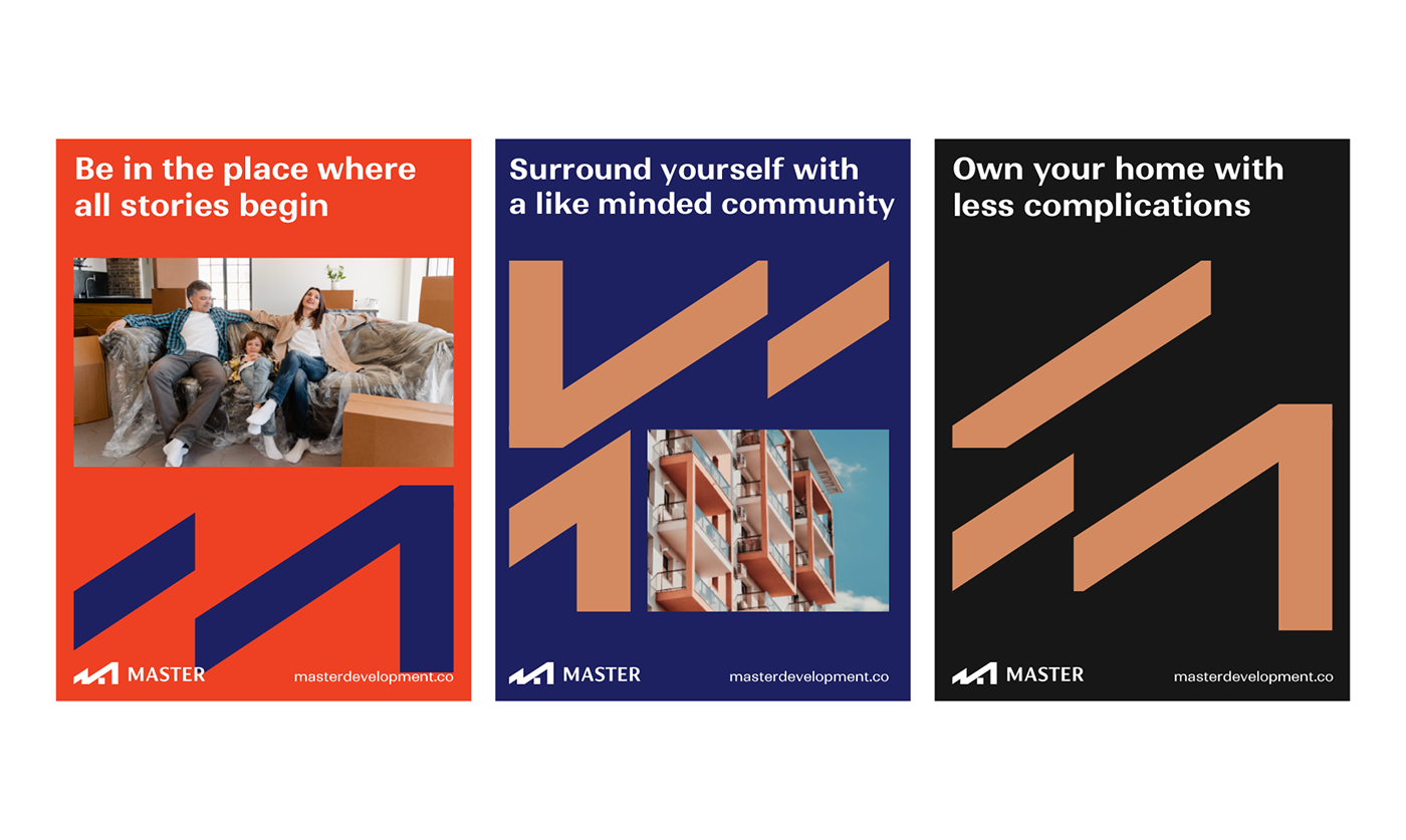
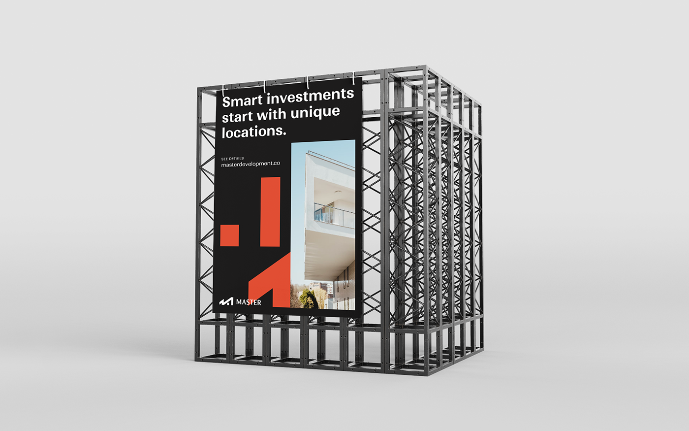
Graphic language
The brand visual system is built upon its main symbol as a key identity object. With sharp rigid lines, the brand visual system works in accordance; sharp diagonal strokes aligned horizontally with a space between each to give the brand the ability to work with other graphic components like our imagery. These sharp strokes can be integrated in various random compositions giving the brand flexibility in use and never ending graphic possibility for different communication materials.